Considering how much I enjoyed Remainder when I read it in 2007, I’m not quite sure why I haven’t read another Tom McCarthy novel since. But now I’ve picked up his latest, Satin Island, in anticipation that it might be shortlisted for this year’s Goldsmiths Prize. I’ve only just begun, but already I’m warming to it (and quite amused by the sly reference on the second page to the ending of Remainder).
I’ll come back to the reading of Satin Island at a later date; but for now, I just want to mention the cover. I love a thoughtful cover design, and there’s a wonderful symmetry between the UK covers of the new novel and McCarthy’s previous one, C.
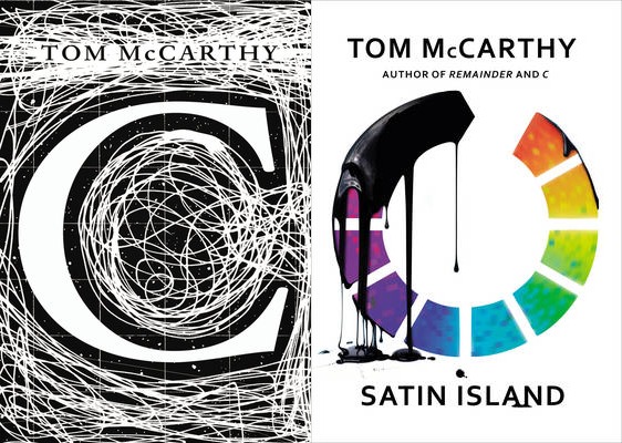
Unless you remembered the cover for C, it probably wouldn’t occur to you that there was a connection; but put them side-by-side and it becomes clear: the inversion of black and white; the letter C turned on its side and given colour to become a buffer symbol (the shape of which also nods to the moniker of Satin Island’s narrator, U.); the dripping oil that echoes the squiggles/networks in the background of C.
These two novels are five years apart, and as far as I know they have no particular link beyond the author; yet the designers have gone to the trouble of doing this. I want to thank them for it, because I appreciate the care and attention they’ve put in.
(One more thing I love: as the Vintage designers’ blog reveals, the oil effect was achieved by using black treacle. Inspired!)
Book details (Foyles affiliate links)
Remainder (2005) by Tom McCarthy, Alma paperback
Satin Island (2015) by Tom McCarthy, Jonathan Cape hardback
C (2010) by Tom McCarthy, Vintage paperback
Recent Comments