I’m always fascinated by the differences in book covers between countries. The Millions runs an annual feature comparing US and UK cover art, and a similar post appeared on Flavorwire a few days ago. I’ve decided to do a cover post of my own, with some of the books I’ve featured on this blog.
(UK covers are on the left, US covers on the right; title links go to my reviews of the books, for context.)
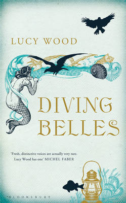
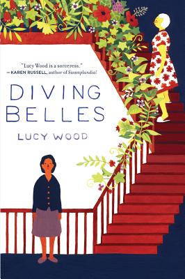
Diving Belles – Lucy Wood
The UK cover indicates folklore and the sea; it’s nice enough, but feels perhaps a little too obvious. The US cover, I think, captures the deeper heart of the book – that mixture of domesticity and sinister magic; I especially love the way that the stairs shade into abstract geometry. Winner: US
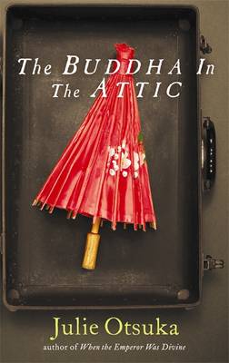
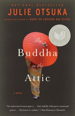
The Buddha in the Attic – Julie Otsuka
Two broadly similar treatments here, with the red parasol as focus. I think the closed parasol in the case evokes the novel’s themes better. Winner: UK
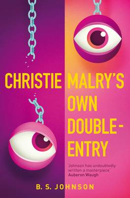
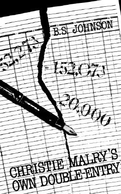
Christie Malry’s Own Double-Entry – B.S. Johnson
The covers of the most recent editions. There’s a simple elegance to both, but for me the disintegrating ledger is a little too literal, especially compared with the boldness of the UK cover. Winner: UK
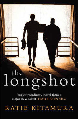
The Longshot – Katie Kitamura
I like the composition of both these covers, but the image of the fighter and his trainer walking away makes it look as though their job is done. The clenched fists of the US cover evoke the tension and violence which are at the novel’s core. Winner: US
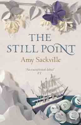
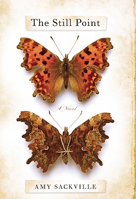
The Still Point – Amy Sackville
Oh, there’s no contest here: the paper cut-out look of the UK cover is gorgeous; the US cover doesn’t come close for me. Winner: UK
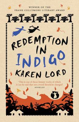
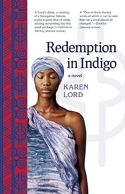
Redemption in Indigo – Karen Lord
The composition of the US cover is elegant, but I think the UK cover better evokes the tone of the book (tricksy-but-serious) . Winner: UK
How to Live Safely in a Science Fictional Universe – Charles Yu
Hmm. Yu’s novel plays with the conventions of both sf and mainstream ‘literary fiction’, which is captured nicely by the UK cover, with its ordered arrangement of laser guns. But it’s also a playful novel, and that spirit is evoked by the US cover, made to look like an old manual, complete with ‘creased’ cover obscuring the publicity quotes. I can’t choose one over the other. Winner: it’s a draw.
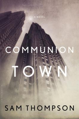
Communion Town – Sam Thompson
I’m not sure either of these covers really captures the essence of Thompson’s book, but the UK one wins out for me as being more intriguing and distinctive., turning a map into abstract art. (Incidentally, this is the cover of the UK hardback; the paperback cover, like the US one, goes down the less-interesting ‘murky skyscraper’ route.) Winner: UK
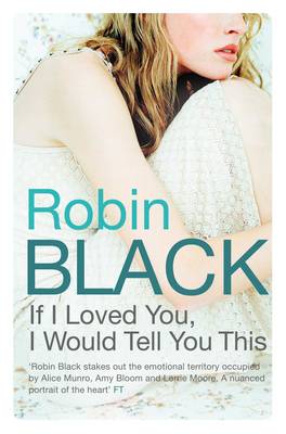
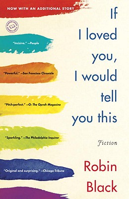
If I Loved You, I Would Tell You This – Robin Black
Well, I don’t think the UK cover is very interesting at all. The US cover is not great, but the paint effect is a nice touch, and the title is used well within the composition. Winner: US
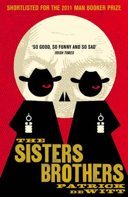
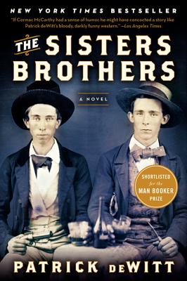
The Sisters Brothers – Patrick deWitt
Wow. What a difference in treatment. I love nigh on everything about the UK cover (it looks even better on the physical object). The US cover is too specific to suit the novel’s air of ambiguity, and just isn’t as well conceived as the more stylised version. Winner: UK
Like this:
Like Loading...


Recent Comments